
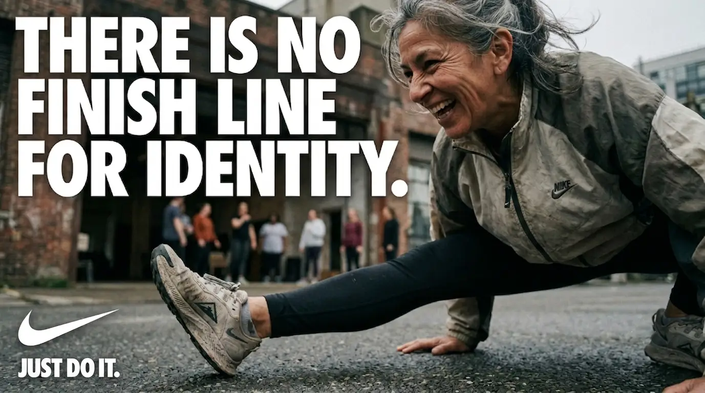
We recently developed a cinematic editorial advertising study for Nike focused on one core idea:
“There is no finish line for identity.”
At VenezArt Multimedia Corp, our goal was not to create a traditional campaign, but to explore how a global brand like Nike could be reframed through documentary realism, emotional texture, and narrative-driven visual language.
We asked a simple question:
What does identity look like when it’s not being sold… but lived?
Concept 1: The Trail Ahead (The “Search” for Identity)
This composition uses the ultra-low angle to turn a routine trail run into an epic journey. The focus is on the runner’s power and determination rather than just the speed.
- Shot Description: A candid, photojournalism-style wide-angle shot captured from near ground level. The protagonist is a female trail runner with sharp, focused features, pushing hard uphill through muddy terrain at sunrise. We see the definition in her muscles and sweat. The composition uses leading lines from the trail to draw the eye to the figure.
- Typography Layout (Nike Style):
- Main Headline (Top Left):
THERE IS NO FINISH LINE - Secondary Headline (Bottom Right):
FOR IDENTITY.(Both set in massive, bold, tightly kerned Futura Condensed Extra Bold.) - Call to Action (Below Title): Just Do It. (Standard Futura, smaller weight.)
- Main Headline (Top Left):

Concept 2: Concrete & Community (Identity Through Movement)
Here, identity is forged in the urban landscape. The low, wide angle makes the city feel expansive and challenging, while the human subject provides the necessary emotional center.
- Shot Description: A candid, wide-angle shot captured from pavement level on an urban basketball court. A young man, is dunking a basketball, is captured mid-air during an expressive move. He wears black Nike training gear; his features are sharp and intensely focused. The photojournalism feel comes from the raw texture of the concrete court and the blurred, supportive community figures watching him in the background.
- Typography Layout (Nike Style):
- Main Headline (Top Right):
THERE IS NO FINISH LINE - Secondary Headline (Bottom Left):
FOR IDENTITY.(The same massive, bold, white sans-serif.) - Call to Action (Below Title): Just Do It. (Smaller weight.)
- Main Headline (Top Right):

Both concepts were designed to push Nike beyond product storytelling into identity-driven narrative systems—where the brand becomes a mirror for personal evolution rather than a message of completion.
This is the direction we believe modern brand storytelling is moving toward:
Less advertising. More authored reality.
At VenezArt Multimedia Corp, we specialize in building cinematic systems that merge branding, film language, and emotional architecture into cohesive visual worlds.
Contact VenezArt Multimedia Corp. today to get started on your docu-style marketing!


